Example 1: HCM Birthday Report
Objective
In this report we want to list employees, sorted by their first and last names, with their dates of birth and age.
The Following Docentric AX features will be used:
- Placeholders for single values
- Conditional content
- Repeating blocks
Final result
Final document will look like the picture below.

Step by step instructions
In the instructions below we assume, that Docentric AX Add-in has been successfully installed. Version 3.1 has been used for this demo.
Step 1: Basic template layout design
- Start MS Word 2007 or higher and open a blank document.
- Create report layout in MS Word as shown in the picture below:

Red numbers on the left margin are not part of the template – they are to depict building blocks of the report, as follows:
- Document uses background color (DESIGN -> Page Color);
- First line will contain the report title (we will add it later, hence we’ve entered XXX for now), we set font, font size and color (e.g. Calibri Light, 28pt, dark red).
- Here we draw a line and set its color and thickness.
- Table with 3 rows and 2 columns will contain report parameters; our table uses Calibri (body), 11pt, bold. First column uses shading. Row height is set and vertical cell alignment is centered for all cells in the table.
- Here we chose numbering, hence the text has been indented and number one is displayed as the first number of the sequence.
Step 2: Make this document a Docentric AX template
In order to make this document a Docentric AX template click on the button Use As Template:

After clicking the button, we must choose Docentric data source package file (.ddsp). This file contains the data source schema and the test data that we will later use for previewing the template document.

Once this is done two Docentric panes open on the right side next to the document and some of the buttons on the ribbon are activated:

The two buttons – Elements and Data Source – actually show (or hide) Element Tree and Data Source panes.
Element Tree pane represents hierarchical structure of tagging elements used in the report.
Data Source pane displays available data sections:
- Parameters
- Main Data
- General Data
We are working in End User Mode, because it’s simpler.
Step 3: Placing our first tagging element

The first placeholder that we will insert on the report will contain the report title. Single value elements are placed in the report by using Field tag:
- First we place the cursor where we want to insert Field tagging element.
- By clicking the Field button on the Docentric AX ribbon, the Field tagging element is inserted
Now we have to bind the newly inserted Field element to the correct data field by using the Binding Control as shown below:

- Field tagging element has been inserted.
- Now we have to bind the Field tagging element to the correct data field in the data source by using Binding Control.
- In order to set the binding for the Field tagging element we select Main Data section as the Binding Source and ReportCaption as the Binding Path.
Resulting template looks like in the figure below:

- The Data Binding for the Field tag is set.
- The Field element's properties pane shows the Binding Source and Path that we set in the Binding Control.
- Element tree now includes the newly added element.
Now we will delete dummy letters XXX before the inserted Field tag and then we will preview the template by clicking the “Preview” button on the ribbon. New MS Word document opens with the resulting report:

As you can see the Field tag has been successfully replaced with the value from the data field that it was bound to.
Step 4: Adding From and To parameters
In the same way as in step 3, we will now add two more Field tagging elements on the report. These two Field tagging elements are parameters, representing the criteria fields used for the data selection:
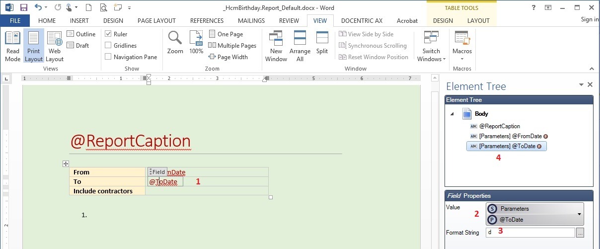
- The “From” Field tagging element is bound to Parameters => @FromDate.
- The “To” Field tagging element is bound to Parameters => @ToDate.
This is the result we get after adding these two parameters:
- Field tagging elements have been inserted.
- They are bound to corresponding data fields in the Parameters section of the Data Source.
- Since the data type of the elements is date, we have chosen display format as well (for format details see https://msdn.microsoft.com/en-us/library/az4se3k1(v=vs.110).aspx).
- The Red icons adjacent to the element nodes inside the Element Tree pane denote formatted data.
Step 5 – Adding conditional content
Conditional content is a very useful feature. By using the If tagging element, we can show or hide the content within this tag. The If tagging element must be bound to a Boolean data field.
In our case we will use conditional content for displaying a checkbox with @IncludeContractors data field element from the Parameters data section. We will create two mutually exclusive conditional contents: one for the case when the value will be true and one when it will be false.
The two conditional contents will then use the following logic:
- if @IncludeContractors = true then
display checked checkbox symbol - if @IncludeContractors != true then
display unchecked checkbox symbol
Now let’s see how to designate conditional content in the template:

- We place the cursor where we want to insert conditional content.
- Clicking on the If button on the ribbon inserts an empty If tagging element.
- We bind the If tagging element to the data (Parameters => @IncludeContractors).
Conditional content (If tagging element) is now inserted and bound with data source element. Content will be displayed when its data value will be true, otherwise it will be hidden.
We will now include checked checkbox symbol, which we will insert from Wingdings font symbols:
- We will select the If tagging element, then press spacebar and backspace to place the cursor into the tag and clear the contents.
- Next we choose INSERT tab on the ribbon.
- By clicking the Symbol drop-down button we get some of the recently used symbols.
- If we see checked checkbox symbol we can choose it and we are done.
- Otherwise, we can open more symbols, choose Wingdings font and then scroll until we find it.
Now the checked checkbox symbol is inserted in If tagging element. We will beautify it a bit: we will change its font size to 16. We will select entire second column of the table, change the color of text to dark red and remove the bold attribute from the text to get this as a result:

Now we also need unchecked checkbox symbol. We will add it just next to the checked checkbox symbol. You should make sure that the first If tag is not selected before you add the second one:
In the picture below, the first If tag is selected. We MUST NOT insert the second If tag now, because it would be nested in the first one and we don’t want that in this case:

Pressing right arrow key moves us out of the first If tagging element and now we can add the second one:
We do everything just as we did with the first If tag except that we now invert the data field value:

Then we insert the unchecked checkbox from Wingding symbols as a content of the If tagging element. This is what we get at this point:

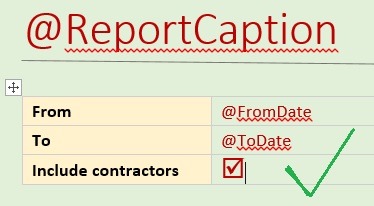
Now let’s preview our report by choosing DOCENTRIC AX menu tab and clicking the Preview button on the ribbon:

Report parameters are now displayed as expected. Because @IncludeSubcontractors parameter is true, only the conditional content for this data value is shown.
Step 6: including repeating blocks of data
Next we want to include birthday data. This data is represented by collection of individual birthday records. We will now include a List tagging element:

- Let’s position the cursor next to the first numbering item.
- By choosing DOCENTRIC AX menu tab and clicking the List button, the List tag is inserted in the report template.
Then we have to choose which collection from the Data Source we want in the list:
- The List tag has been inserted.
- We now bind it to the data using Binding Control window.
- In our case we choose Main Data section as the Binding Source and HcmBirthdayTmp as the Binding Path.
Usually we also want to define sorting in the collection. In our case we will sort by Name:

- Sorting can be controlled by clicking the button as shown in the screenshot above. Sorting window opens.
- New sort by fields can be added by clicking the “+” button.
- Drop down list box shows data fields in current collection which can be included in sorting.
- We choose to sort by the Name data field in ascending sort order.
The List tag is now defined, but has no content yet. We will add some Field tags to it and bind them to data:

- We make sure that the List tag is selected.
- Insert a new Field tagging element inside the List tagging element.
We will now choose Name data field in the current data context. Since we need to bind this Field tagging element to the Name data field, we need to set binding source to the current data context which represents the “current” record, provided by the parent List tagging element:

The Field tagging element is now bound to the @Name data field from the Binding Path:

Now we move cursor to the right out of the current Field tag:

- By pressing right arrow key we move the cursor to the right.
- When we see that we are in the List tag, we can add additional content to it.
We will now insert a comma and a space and then insert another Field tag and bind it to @BirthDate data field in the Binding Path:
Again, we move the cursor to the right, out of the Field tag, but still within the List tag, insert some empty spaces and an opening round bracket and then add another Field tag and bind it to the Age data field. Move to the right, out of the Field tag and add closing round bracket. Select everything in the brackets and change text color to grey:

And we're done! Congratulations for your first Docentric AX report.
Preview the report to see if everything is as expected.
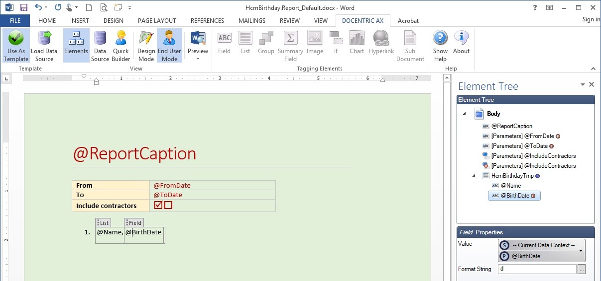
Step 7: Inspecting the Element Tree
You can inspect individual tags by clicking the items in Element Tree pane structure. When you click an element in the Element Tree pane, respected tag in the report is selected as well. Element properties give you all information about individual tagging elements.
The picture below shows the result when we click “@BirthDate” tagging element in the Element Tree pane. The corresponding Field tag, which is bound to this data element, also becomes selected.
